


01HomeWIREFRAME
CASE STUDY · JUMP EXPERIENCE
A concept for the JUMP e-bike app and handlebar console that turns a ride around Providence into a way to explore it. Researched with the students who ride.


Team
Team of five
Providence, RI
Platform
iOS app
Bike console
Scope
Concept redesign
Research to prototype
Timeline
2019
Refreshed in 2026
(01)
What the project is, what I did, and what we made, in thirty seconds.
01
College students in Providence rarely explore the parks and trails around them. We looked at how JUMP, the e-bikes many of them already rode, could change that.
02
On a five-person team, I interviewed and surveyed students, then used what we learned to redesign the JUMP app and the phone console on the bike’s handlebars.
03
A tested prototype of an app that suggests places to ride, guides you there and rewards the trip, and a console with lit controls, a rotating mount and wireless charging. In 2026, I refreshed the app’s UI.
KEY DECISIONS
01
Start from the bikes students already ride
02
Suggest places, guide the ride, reward exploring
03
Design the console around the rider’s phone
STATUS
A 2019 team concept, polished in 2021 and refreshed in 2026. JUMP’s own app no longer exists.
(02)
Our assigned site was India Point Park in Fox Point, where the 14.5-mile East Bay Bike Path begins. We mapped who used it, what was there, and who was missing.
College students filled the neighborhood around the park. They were the people we saw least in it.
01
WHAT WE SAW
Open, unused space; few benches, lamp posts or water fountains; no maps or information boards.
THE OPPORTUNITY
Show people the park and trail exist, and what they can do there.
02
WHAT WE SAW
Busy with studio and schoolwork and rarely off campus. Many had never heard of the bike path.
THE OPPORTUNITY
Give them a reason, and a route, to leave the campus bubble.
03
WHAT WE SAW
JUMP’s red e-bikes were everywhere around campus, and students rode them every day.
THE OPPORTUNITY
Use a ride students already take as the way to discover the city.
FIELD MAP · INDIA POINT PARK
We charted who was there and where: bikers, runners and scooters on the path, families picnicking, people fishing, and students working on the benches. What stood out was all the space nobody used.
(03)
We interviewed and surveyed RISD and Brown students about India Point. Most had never been, yet more than 8 in 10 wanted to know what their city had to offer.
SURVEY · 01
of students had never been to the East Bay Bike Path, or had never heard of it.
SURVEY · 02
believe knowing their city’s green spaces, trails and activities matters to their lifestyle.
SURVEY · 03
would prefer to go biking at India Point Park.
SURVEY · 04
would like to know which places are available to them while they bike.
STUDENT INTERVIEW
“I feel like I don’t have as much time to go out and explore the path and park because of time constraints and, honestly, I didn’t know it existed.”
— Student, interview
STUDENT INTERVIEW
“Find a way to bring attention to this area, because it does exist, yet many new young people like me don’t know that.”
— Student, interview
WHAT WE LEARNED
Students saw biking as the most enjoyable way to explore, and believed drawing attention to places like India Point would improve student life.
— Main takeaway
(04)
UX researcher and designer on a five-person team in Providence. I led interviews and surveys, then turned what we learned into the app and console redesign.
Use JUMP as a tool to connect students with Providence and its landscapes.
— Our design opportunity
PROJECT
JUMP Experience
A concept redesign for JUMP’s e-bikes
ROLE
THE RESEARCH TEAM
Jorge Andres Vargas — research, app & console
Kaanchi Chopra · Yutao Huang — research & design
Trent Lowe · Theo Goldstein — research & design
TOOLS
Adobe XD · Illustrator · KeyShot
01
Observed India Point, interviewed and surveyed RISD and Brown students, then ran a second round with JUMP riders.
02
Mapped the journey and structure, wireframed and prototyped the app in XD, and tested it with students in two rounds.
03
Studied the bikes, sketched mount concepts and refined the console through two rounds of feedback.
(05)
JUMP’s electric bikes were popular with students and ridden daily. If the ride itself could suggest where to go, JUMP could connect students with Providence and its landscapes.
WHAT JUMP RIDERS ASKED FOR
The most common request. It “would be cool for getting somewhere specific, or suggestions on where to go,” a RISD student told us.
A list of nearby places to visit, so riders know what’s out there before they set off.
“I would like to visit and explore Providence to get away from the fast-paced, chaotic nature of a city,” another said.
(06)
To understand the service, we first studied the bikes themselves: how riders unlocked them, where the phone went, and what it was like to ride with one at night.

SKETCHES & IDEATION
Every idea came from what we saw on the bikes and heard in critiques: where the phone could sit, how a mount could hold and turn it, and how a rider would use it.
01
The activation buttons weren’t lit, so they were hard to use on a night ride.
02
The rigid phone mount was tough on phones and could easily scratch them.
03
The mount’s angle made riders look down at their phone for long stretches while riding.
04
Phones couldn’t rotate, so they stayed in landscape whether that suited the ride or not.
05
The QR code that activates the bike could be hard to find.
FEEDBACK
First: practical, but try more ways to hold the phone, add rotation and address safety. Then: lower the scale, add official branding and fit more phone sizes.
FROM OBSERVATION TO CONSOLE

Unlocking meant finding the QR code and wedging a phone into a rigid, landscape-only mount.

Clip-on, rotating and pressure-fit mounts, drawn over photos of the real bike.

The rotating concept on the bike, before a final round of feedback shaped the finished console.
(07)
JUMP’s own app could find and unlock a bike, but not much else. We audited both versions, prototyped fast and tested with students, then mapped the journey and structure before designing every screen.
WIREFRAMES
All ten original wireframes, redrawn. Each draws itself in, then the flow plays through and every wireframe wipes into its final design.
01
It showed nearby bikes and let you rent one, nothing more: no parks, no navigation and no link to the bike’s buttons.
02
A cleaner map and an easy barcode unlock, with Google Maps added, but still no directions.
03
Testers found the flow from choosing a place to navigating clear, and liked the new Ride Rewards.
04
Too much red, a buried ‘Nearby Locations’ page, and a home screen that needed a personal greeting.
05
A journey map and an information architecture set where each feature lives, from onboarding to ending a ride.
ROUND TWO
Next came a high-fidelity XD prototype with a calmer palette, a slide-up sheet for places and a greeting, tested again with students.
HOW THE APP EVOLVED

The map stays, with search floating over it, categories one tap away and parks nearby in a sheet.


The all-red first pass became a calm, light map with one red route and one red button, closer to the Uber app testers pointed to.


The wireframe’s structure carried through: search first, then four categories to explore, now as tiles in one sheet.
THE USER’S JOURNEY
How a ride feels, stage by stage: low while you hunt for a bike and unlock it, rising once the app suggests where to go, and peaking as you explore.
INFORMATION ARCHITECTURE
Onboarding leads to one home screen with three journeys: Explore, Scan & ride, and the Menu. Pick one to follow its path.
(08)
The final app, refined from the prototype we tested with students: open it, pick what you’re in the mood for, and ride. JUMP suggests places, guides you there and rewards you for going.
01 / 09 — EXPLORE
JUMP opens on a live map of Fox Point and College Hill. Parks, trails, cafés and gyms are pinned around you, and the places nearest you wait in a sheet below.
02 / 09 — SEARCH
Tap Where to? to search, or pick what you’re in the mood for. Four categories cover the city, from bike trails to cafés, and recent places are one tap away.
03 / 09 — COMPARE
Parks & Recreation lists each park with its distance, ride time, rating and the points you’ll earn for parking there, sorted for you.
04 / 09 — DECIDE
Each place shows what you can do there, from the bike trail to the waterfront, and how other riders rated it. One red button takes you there.
05 / 09 — ROUTE
Before you start, see the route on the map with the time and distance, choose the fastest, scenic or flattest way, and check the price.
06 / 09 — UNLOCK
Scan the code on the bike’s console to unlock it. The power button lights up when the bike is ready to go.
07 / 09 — RIDE
With the phone in the console, the next turn is the biggest thing on screen, with arrival time, battery and points in view, even on a night ride.
08 / 09 — FINISH
End the ride to see the time, distance and cost. Rate the place so other riders find good spots, and save the route for next time.
09 / 09 — RETURN
Saved rides wait in the Rides tab with their maps, ready to ride again, next to routes other riders recommend nearby.
RIDE REWARDS
Riders earn points for parking at popular places, then redeem them as ride credit: a small nudge to try somewhere new next time.

(09)
The final console keeps the phone at the center of the ride, carries the JUMP name, and puts every control a rider needs within reach of the handlebars, lit for night rides.
FROM THE LAST CRITIQUE
Branding, rotation and room for any phone
The final round of feedback asked for official branding, a mount that rotates for a landscape view, and room for different phone sizes. The console answers all three.

INTERFACE BUTTONS & PLACEMENT
Each control does something on the phone: power, pause and search on the left, wireless charging on the right, and the QR code where a rider can see it.
THE FINAL CONSOLE

The JUMP name runs down the console’s face, so it reads as part of the bike, not an add-on.
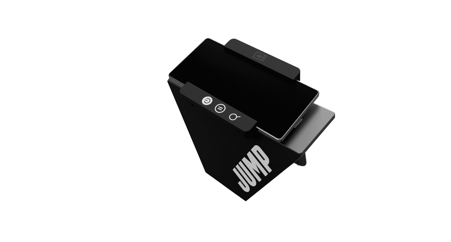
The mount turns a quarter-turn, so the phone can sit upright for lists or sideways for the map.
(10)
We tested two prototypes with students: a rough first pass, then a high-fidelity version built in XD. Here’s what changed, and what testers said about the second.
THE PROTOTYPES WE TESTED

Testers found it clear from choosing a place to navigating, and liked Ride Rewards. But there was too much red, ‘Nearby Locations’ was hard to find, and the home screen felt impersonal.

Built in XD with a calmer black-and-white palette, one bright action per step, a slide-up sheet for places, and a greeting by name on the home screen.
HI-FI PROTOTYPE TEST
The interface looked more refined and professional than the first version we tested.
— What testers told us
HI-FI PROTOTYPE TEST
The slide-up sheet made it easier to find locations, and to reach the ‘Nearby Locations’ page.
— What testers told us
HI-FI PROTOTYPE TEST
Overall, a better experience than the first edition, and one that feels more personal.
— What testers told us
(11)
Three months from a first walk around India Point to a tested prototype: an app that turns a JUMP ride into a way to explore Providence, and a console designed with it.
Two rounds of testing with students
Explore, navigate, save routes and earn rewards
A console from lit buttons to a rotating mount
(12)
The original screens were designed in 2019 and polished in 2021. Revisiting the project, I kept the research and every idea that tested well, and brought the interface up to today’s iOS patterns and accessibility standards. The screens throughout this case study show the refreshed design; here’s what changed.
2021 → TODAY

The hamburger menu and grey sheet became a floating search bar, category chips, place cards and a tab bar.

The next turn is now the biggest thing on screen, with arrival time, bike battery and points at a glance.

Points now show progress toward a free ride, and the ways to earn are spelled out instead of hidden behind a question mark.
01
Explore, Rides, Rewards and Profile are one tap away, and Scan to ride floats where your thumb already is.
02
Places, routes and the ride slide up over a live map instead of replacing it, so riders never lose their bearings.
03
A dark map, large type and a Live Activity on the lock screen, so riders don’t need to unlock their phone mid-ride.
ACCESSIBILITY
Every control is at least 44 points, text meets WCAG AA contrast, and layouts leave room for larger text sizes. The action red was deepened to #D62828 so white labels stay readable, while JUMP red stays for the route and brand.

(13)
Three things this project taught me about designing for how people move through a city.
01
Mapping India Point in person showed us who was missing from it, something no survey alone would have told us.
02
The console and the app only worked once each was designed around the other: the buttons open the app, and the mount holds the map.
03
Students already rode JUMP every day. Giving that ride a reason to explore was easier than asking them to start something new.
UP NEXT
CASE STUDY 001 · PLURR
Shared photo albums for the people you meet at events — three rounds of field research, one productive failure, and App Store acceptance.
ROLE
Lead Product Designer
PLATFORM
iOS & Android
View case study


