CASE STUDY · PLURR TECHNOLOGIES · 2025—26
Plurr.
Shared photo albums for the people you meet at events. Do now. Connect later.


Team
Timeline
Platform
iOS & Android
web research prototypes
Status
Accepted
Apple App Store
(01)
The short version
What Plurr is, what I owned, and how it landed — in thirty seconds.
01
The challenge
Make it effortless to share a night’s photos with the people you met there — and turn those strangers into real connections the next day.
02
What I did
Led a design team of three. Ran three rounds of field research at live events, set the product direction and designed Plurr’s first real design system.
03
The outcome
92% of round-one testers came back on their own. Round three was unanimous on direction, and the app was accepted by the Apple App Store.
KEY DECISIONS
01
Test at live events, not in a conference room
02
Trade the ‘too corporate’ look for an expressive system
03
One front door: everything hangs off the camera
STATUS
Accepted by the Apple App Store. The team is fixing bugs ahead of release.
(02)
The problem
It started with a much smaller idea, and a question on a whiteboard in October 2025.
Everyone leaves a show with a hundred photos and no practical way to get them to the people who were standing next to them.
01
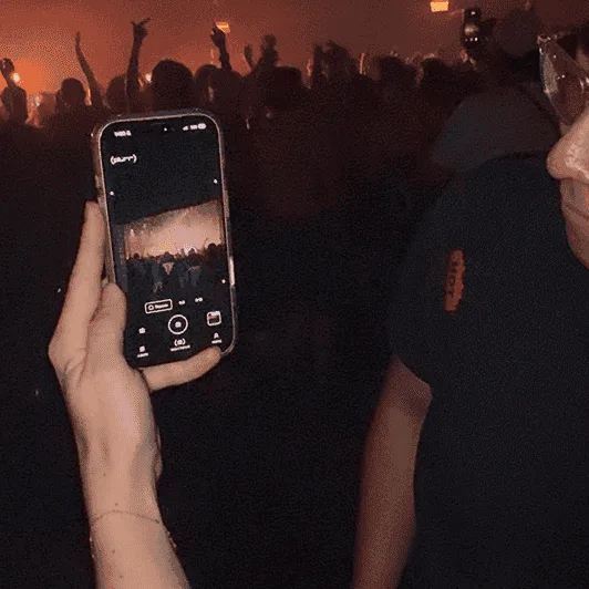
Group chats decay.
Photos get buried under the next day’s messages.

02
AirDrop only works while you’re still in the room.
By the time you think to share, everyone has gone home.
03
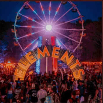
Instagram turns it into a performance.
Posting is curated and public. A night out isn’t.
THE WHITEBOARD QUESTION · OCT 2025
“What if people could share photos with their friends and connect after the event?”
Everyone at a show is taking photos of the same night. The question was how to get them into one place — and whether the people in them could find each other again.

(03) The reframe
The photos weren’t the point.
They were the excuse.
A shared album is a record of a specific group of people who chose the same room on the same night. Solving for storage gets you a utility. Solving for the people in the album gets you a product.
AT THE EVENT
Do now.
No patience and one free hand — dark, loud, low battery, patchy service. Capturing has to be instant.
THE NEXT MORNING
Connect later.
Unhurried and in the mood to curate. This is when the people from last night become more than faces.
Two halves, hours apart, in completely different states of mind. That tension is what the whole design had to resolve.
(04)
Leading design
A design function of three inside a seven-person company: nowhere to hide a bad decision, and no process to blame for one.
“Most of my job as design lead isn’t producing screens. It’s holding a line while a seven-person company under launch pressure argues for all of it.”
— On what leading design actually is
3
designers on the team I lead, me included
7
people in the whole company
01
Direction & system
I directed our design system and core strategy, and set the constraints the rest of the team designs within, so the bar on consistency held.
02
Research, end to end
I recruited participants on the ground at events, ran the sessions, and synthesized what we heard into direction changes.
03
Engineering partnership
I pressure-tested feasibility with our engineers early and stayed in the loop, rather than throwing files over a wall.
(05)
Who it’s for
People whose social lives are organized around going out — and who keep meeting people they never see again.

[ 01 / 02 ]
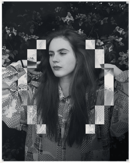
The Regular
Goes out most weekends: raves, festivals, club nights, shows. Roughly 18–30, deeply invested in the scene’s aesthetic and etiquette. Documents constantly, posts selectively.
Goal
Capture the night without missing the night, and hold onto the people in it.
Pain
Ends every night with 200 photos nobody else will see, and new faces with no names attached.
Context
Dark, loud, one-handed, low battery, patchy service.
[ 02 / 02 ]
New to the Scene
Buys the tickets, makes the group chat, then spends the following week chasing everyone for photos. Often slightly more organized than the rest of the group.
Goal
Turn a good interaction into an actual connection.
Pain
Asking for an Instagram feels like a bigger move than it is. A QR scan doesn’t.
Context
One good interaction they don’t know how to continue.
(06)
Go where the users are
We did not want to test this in a conference room.
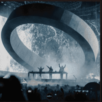
I pushed for a web version first, deliberately: no TestFlight friction, no install, no gatekeeping. Then the team went to events together, and I approached people directly and asked them to scan a QR code to join.
WHAT WE NOTICED
The QR code stopped being a research tool and became Plurr’s front door.
Joining by scan became the primary entry point. The feedback came back immediately — and bluntly. That was the point.


(07)
Three rounds, three claims
Each round started as a written, falsifiable hypothesis — so “it went well” could never be the finding, and so I could accept round two instead of arguing with it.
ROUND 01
37 TESTERS
Prove the core loop.
People will join a shared album from a QR code at a live event, and the infrastructure will hold under concurrent uploads on venue wifi.
Two features — private albums joinable only by QR, and image uploads. Illustrative and low-fidelity on purpose: we were testing a mechanic, not a brand.
34 of 37 came back on their own. The reason they gave was simplicity. The backend held.
Wireframes

Prototype

Signal
34
/ 37 testers
Came back on their own.
Wireframes
Prototype

Signal
23
/ 47 testers
Rejected the visual direction.
VERDICT · HALF WRONG — MY HALF
ROUND 02
47 TESTERS
The productive failure.
Profiles and sharing will deliver the “connect later” half, and a more modern visual language is needed to hold them.
Album creation and editing, joined and saved albums, user profiles, and a cleaner, more structured look.
The features landed — but 23 of 47 rejected the visual direction. “Too corporate. Bland.”
ROUND 03
60+ TESTERS
An expressive system.
A design system can be expressive enough to belong in this scene and consistent enough to scale — and handing theming to users resolves the mismatch.
Plurr’s first real design system, a darker, louder visual voice, and theming people control themselves.
Unanimous on direction. 56 asked for more social features. 12 were blocked by bugs, not design.
Wireframes
Prototype

Signal
60+
testers
Unanimous on direction.
(08) The turning point
“It feels too corporate and bland.”
— 23 OF 47 ROUND-TWO TESTERS
Functionally better. Culturally, it missed.
Nobody said the app was broken. The 23 were reacting to a mismatch between the product’s identity and its visual voice — and the objection was concentrated among our most scene-invested users, the ones we most needed to win.
The rave and festival community is animated, expressive, loud and fun — a scene built on outfits, lights, flyers and stage design. We had designed it a productivity tool. They didn’t want to be organized. They wanted to be expressive.
[ WHAT WE MADE ]
#F4F5F7
#D7D9DE
#9DA2AB
#5C6169
#2A2C31
Neutral. Structured. Legible. Professional.
Every choice defensible in isolation — and wrong together.
[ WHAT THE SCENE LOOKS LIKE ]
#E01A2B
#F0721C
#E8D021
#25C462
#8B4FE0
Loud. Animated. Expressive. Maximalist.
Outfits, lights, flyers, stage design — the scene’s actual visual language.
We had optimized for legibility and lost belonging.
In a community with a strong aesthetic identity, visual design isn’t decoration layered on top of the UX — it is the UX. A neutral, “professional” interface told people we didn’t understand who we were building for. Trust was the thing we broke, and trust is a usability problem.
DRAG, OR USE THE ARROW KEYS, TO COMPARE V2 AND V3

(09)
An expressive system
Expressive enough to belong in the scene, consistent enough to scale — not one at the expense of the other, which is the trap I’d fallen into the first time.
DESIGN SYSTEM V1.0

A dark-first design system for shared photo experiences — built for immersive, ambient interfaces that let photography take centre stage.
VERSION
1.0 · September 2026
PLATFORMS
iOS · Android
TYPEFACES
Space Grotesk · Dubsteptrix
DESIGNED BY
Design team of three, led by me
Dark first
Every surface starts from black. Depth comes from progressively lighter darks, not brightness — photography and content are the light source.
Immersive atmosphere
Ambient gradients of crimson and ember create warmth and mood. The UI fades back so shared moments take centre stage.
Ghost chrome
Interactive elements are outlined, not filled — borders over fills, opacity over colour — so the interface stays out of the way.
Vinyl aesthetic
Album cards echo records with concentric circles. Physical music culture meets digital photo sharing: tactile, collectible, personal.
CORE BACKGROUNDS
Black
#000000
Base background
Dark 900
#0D0D0D
Page background
Dark 800
#171717
Card surfaces
Dark 700
#1A1A1A
Elevated surfaces
Dark 600
#1B1B1B
Modal overlays
Dark 500
#222222
Borders, dividers
ACCENT COLORS
BRAND
Crimson
#860000
Primary accent, gradients
48%
Ember
#BA3E00
Gradient midpoint
14%
Peach
#FFC4A7
Warm highlights
STATUS
Alert red
#FC3532
Status, notifications
SIGNATURE GRADIENT
TEXT + OPACITY SCALE
Aa
Primary — 100%
Headlines, titles, primary actions
Aa
Secondary — 64%
Body text, descriptions
Aa
Tertiary — 42%
Captions, metadata, timestamps
Aa
Quaternary — 16%
Borders, subtle dividers, disabled
FONT FAMILIES
PRIMARY — UI TYPEFACE
Space Grotesk
Aa — Regular
Aa — Medium
Aa — SemiBold
ABCDEFGHIJKLMNOPQRSTUVWXYZ
abcdefghijklmnopqrstuvwxyz
0123456789 !@#$%&*()
DISPLAY — BRAND TYPEFACE

App logo, brand wordmark, hero display text · Regular only

TYPE SCALE
24
Display — The night, captured together
20
Heading — The night, captured together
16
Title — The night, captured together
14
Body — The night, captured together
12
Caption — The night, captured together
10
Micro — The night, captured together
SPACING SCALE
4px
8px
10px
12px
16px
20px
24px
36px
48px
64px
CORNER RADIUS
2px
radius-xs
4px
radius-sm
8px
radius-md
32px
radius-lg
100px
radius-xl
Full
radius-full
CONTAINER PATTERNS
Base surface
Card surface
Elevated surface
Input surface
BUTTON VARIANTS
GHOST / OUTLINED
Add friend
Add to album
Create album
ACTIVE / SELECTED
Latest
Your albums
Saved
ICON BUTTONS
Search
Share
Options
PILL / CAMERA ACTIONS
Save later
Add album
Join
FILTER TABS + BOTTOM NAVIGATION
Tabs and navigation cycle their active state here to show the inversion: selected items flip to a white fill with dark text, inactive items stay ghosted.
ALBUM CARD
head trip 2026
12 photos · 3 friends
View
Save
elements 2026
24 photos · public
View
Save

chris lake
8 photos · private
View
Save
PROFILE HEADER

@chrislake
20
Albums
141
Friends
Add friend
Add to album
CAMERA UI
Save later
Add album


It became the system my two designers and I worked within from then on.
(10)
One front door, two objects
Everything hangs off the camera, the album and the profile. Keeping it that narrow let us add depth in round three without spending the simplicity that earned a 92% return rate.
THE FLOW — FAST AT THE EVENT, SLOW AFTER
Fast mode · At the event
No patience · one hand · eyes-free
Encounter
Scan a code, or tap a text
The scanner lives in the camera
[01]
Capture
Shoot into the shared album
Ratio, review, save
[02]
Slow mode · After
Unhurried · browsable · in the mood to curate
Relive
Theme it, tag the event
The album becomes a memento
[03]
Connect
Profiles, shared artists
A reason and an opening line
[04]
Return
Home: your album history
Pin favourites to the profile
[05]
Each night leaves an album and a set of profiles — so the next encounter starts warmer.
THE ARCHITECTURE — ONE FRONT DOOR, TWO OBJECTS
[ COLD START · THE FRONT DOOR ]
ENTRY POINT
Camera
Login lands here, not a feed.
Shoot one or many → make an album
Scan a QR code to join one
[ INVITE PATHS ]
Text
Reaches non-users
QR code
Scanned in-app
CREATES / JOINS
[ CORE OBJECT · SHARED ]
Album
Private by default · many contributors
Collective photo stream
In-app camera — ratio, review, save
Event tag
Colour-wheel theme
Host controls — limits, editing
Owner-scoped permissions
PIN
[ CORE OBJECT · PUBLIC ]
Profile
The “connect later” surface
Favourite artists
Pinned photos
Albums you appear in
SoundCloud API
Artist data pulled in
[ SURFACE · RETURN VISIT ]
Home
Sorted by relationship, not date
Albums you created
You host
Invited to
Someone scanned you in
Past albums
Your history
(11)
One night, five moments
From the first shot at the show to the friend request the morning after.
01 / 05 — CAPTURE
Camera-first cold start
The app opens on the viewfinder. Registration marks frame the live shot so it reads as the subject, not a control panel. Aspect ratio sits right under the frame, because framing is the one decision people make mid-shot — and the shutter is oversized and centred for thumb reach.
WHY IT MATTERS
Round one proved people return for simplicity. Camera-first kept that feeling as the product got deeper — the fastest path stayed the default path.
02 / 05 — CREATE
Shoot first, album second
You take one photo or twenty, then turn them into an album — not the other way round. Naming a container before you have anything to put in it is a desk behaviour, not a dance-floor one.
DESIGN DECISION
The empty state has one action, not three. If you’re looking at it, you’ve already told us what you want: to shoot.
03 / 05 — SHARE
Two ways in: a text, or a code
Send an album by text, or let people scan its QR code with Plurr’s own camera — the screen the app already opened on. Joining an album is a gesture, not a flow.
TRADE-OFF WE ACCEPTED
SMS hands the invite to a channel we don’t control and can’t measure well — but it reaches people who don’t have the app yet, on the channel they already use.
04 / 05 — RETURN
Albums sorted by relationship
People don’t remember albums by date. They remember “the one Jess made” or “the one I got invited to” — so the albums surface splits into invites, recent and yours. The information architecture matches the sentence.
CRAFT DETAIL
“(0 uploads)” is shown, not hidden. An empty album is an invitation to shoot, so the count is a prompt, not an embarrassment.
05 / 05 — CONNECT
A profile built on taste
Top artists, pulled from SoundCloud, render as record sleeves with the vinyl sliding out — in this scene a record is a more honest credential than a follower count. Mutual albums, the nights you were both at, are the social proof.
WHY THIS CLOSES THE LOOP
Add Friend and Add to Album are the whole thesis in two buttons: acknowledge the person, then put them in the next night.

(12)
Every state, designed
One invite or two, no recent albums, an empty saved list — sparse states get the same care as full ones. That’s what keeps a new user’s first week from looking broken.
(13)
Where it landed
Accepted by the Apple App Store. The team is fixing bugs ahead of release.
92%
Of round-one testers returned unprompted
60+
Round-three testers, unanimous on direction
56
Asked for more social features
12
Blocked by bugs — not by design
(14)
A marketing site for the scene
I also direct Plurr’s marketing, so the website had to pass the same test as the app: it couldn’t read as corporate. I designed it for ravers and festival-goers, with its own type pairing, palette, labels and motion.

THE SITE
The Plurr site on laptop, tablet and phone, each with a layout of its own.
01 — INTRO LOADER
An intro in poster cuts
I based the intro on a reference video of poster cuts. Event photos and type cards cut behind still pixel brackets, under three cuts a second, then the wordmark lands.
02 — LABEL SYSTEM
Labels from a photo lab
I started from techwear label packs and moved them into a photo lab: film rolls, contact sheets, polaroids and lab slips. The lab slip records a real milestone: Accepted, Apple App Store.
03 — PIXEL KIT
Pixel icons and a viewfinder cursor
The logo’s brackets are pixel art, so every icon is too. The cursor is a viewfinder: it frames links, aims a crosshair at photos and trails pixels that invert what they cross.
04 — HERO GLOW
An ember glow that follows you
I kept the ember glow from my Figma hero fixed behind the page. It drifts, changes shape as you scroll, leans toward the cursor and dims so text stays readable.
BRAND GUIDELINES
Loud, with rules.
I direct marketing as well as design, so I set the site’s rules down in a brand guideline: one ember accent, a pixel wordmark, lowercase headlines and motion anyone can pause.
ACCESSIBILITY
Pause motion, in the hero and footer, follows your reduced-motion setting until you choose. With motion off, the intro is skipped. Text meets AA contrast over the glow, and the intro stays under three cuts a second.
EVERY SCREEN
Phones, tablets and landscape screens each get a layout of their own, and the pinned How it works tour has three versions. Nothing asks you to swipe sideways: a swipe row that got stuck on touch became a zig-zag.
ITS OWN SYSTEM
The site keeps Dubsteptrix from the app but pairs it with Space Mono. It adds bracketed [001] section heads and one ember accent taken from the hero glow.
FACTS ONLY
The copy comes from the case study, facts only. I kept the testing numbers off the site and told the testing story in words instead: built on the dance floor, not in a boardroom.
(15)
What I’d argue for now
Six things this project taught me — and why I’d fight for each on the next one.
01
Test where the behaviour lives
A web prototype and a QR code at a real event removed every barrier between me and honest feedback. The method was so frictionless it became a feature.
02
Ship small enough to be wrong cheaply
Round one had two features. That’s exactly why we could afford to discover it wasn’t enough.
03
“Modern” is not a neutral choice
Round two was better crafted than round one and still missed, because it signalled the wrong values. Every visual decision tells users whether you’re one of them.
04
A design system is strategy, not cleanup
I only got expressive and consistent once I stopped treating visuals as a coat of paint and designed a language with rules in it.
05
When users reject your aesthetic, hand them the controls
The colour wheel settled an argument I was never going to win by choosing better myself.
06
Keep the design signal separate from the build
The 12 people lost to bugs weren’t telling me anything about the design. Knowing which feedback is yours is part of running research properly.
UP NEXT
CASE STUDY 002 · LIFEHIVE

LifeHive Nutrition
A website and design system for a community-based nutrition practice. Designed to earn trust.
ROLE
Lead Product Designer
SCOPE
Website · Design system
View case study