CASE STUDY · LIFEHIVE NUTRITION
LifeHive.
A website and design system for a community-based nutrition practice. Designed to earn trust.

Studio
Studio Newfound
formerly Polyframe
Client
LifeHive Nutrition
East Coast
Scope
Website and design system
Timeline
Jul – Dec 2023
Six months, remote
(01)
The short version
What LifeHive is, what I owned, and what shipped — in thirty seconds.
01
The brief
LifeHive was restructuring. It needed one clear, trusted home online for nutrition counseling, corporate wellness and a 30-day challenge, backed by dietitians who accept most major insurance.
02
What I did
As lead product designer at Studio Newfound, I owned the website: wireframes shaped by user feedback, usability testing on every round, and a web design system built on the new brand.
03
What shipped
A fully responsive site at lifehivenutrition.com, launched in December 2023, that guides each audience to the right offer and one clear next step.
KEY DECISIONS
01
Usability-test every round, from grey-box wireframes up
02
Grow a web design system from one leaf
03
Lead with a person, a promise and one clear action
STATUS
Launched in December 2023. The client has since redesigned the site.
(02)
Nutrition counseling, rethought
LifeHive’s registered dietitians help people and organizations get healthier through individualized nutrition, stress management and lifestyle coaching. They accept most major health insurance, so expert care isn’t a luxury.
LifeHive was mid-restructure and needed a fresh identity. The site had to present three very different offers as one trusted practice.
01
Individual nutrition counseling
FOR
Individuals with personal health goals
THE SITE’S JOB
Make a first appointment feel easy to book and safe to start.
02
Corporate wellness programs
FOR
Employers and their teams
THE SITE’S JOB
Show credibility and scope to someone buying for a whole team.
03
The Evolution Challenge
FOR
Coworkers, as a team
THE SITE’S JOB
Gather a 30-day wellness sprint — daily and weekly goals, friendly competition and weekly counseling — in one clear place.
(03) The goal
Earn trust
before the first appointment.
Three goals shaped every decision: make each service clear, make the practice feel credible from the first screen, and guide new and returning visitors to the right next step.
Clarity for every offer
Trust at first glance
A guided journey


(04)
Who it’s for
Individuals chasing personal health goals, employees in corporate wellness programs and coworkers taking on the Evolution Challenge. Different starting points, one shared ambition: to put health first.
PERSONA
Sarah, a busy professional
Looking for guidance on stress management and health habits she can actually keep.
WHAT THE SITE GIVES HER
Tailored nutrition counseling that’s easy to start
Structured support through the Evolution Challenge
Corporate wellness that fits her workplace
A library of health and wellness resources
(05)
My role
Lead product designer at Studio Newfound, working remotely from California with LifeHive’s East Coast team.
“I worked at ensuring a good user experience for our client’s brand.”
— On the job, at Studio Newfound
ROLE
Lead Product Designer
TEAM
Sebastian Calvo — Product Manager
Billy DeNatale — Lead Graphic Designer
Jorge Andres Vargas — Lead Product Designer
TOOLS
Figma · Adobe Creative Cloud
01
Wireframes
Ran collaborative sessions, analyzed user feedback and turned it into wireframes for every page and offer.
02
Usability testing
Tested each iteration so visitors could find a service and the information they came for without friction.
03
Web design system
Translated Billy’s brand guidelines into a system for the web: components, type, color and layout rules.
(06)
Wireframes, tested every round
Collaborative sessions and user feedback shaped each round, from grey-box wireframes to full pages in color, and every iteration was usability-tested before the next.

THE FIGMA FILE
Every page in one file — landing, about, team, insurance, doctor referrals, individual counseling, corporate wellness, challenges and the challenge overview — iterated side by side.

01
Wireframes
Grey-box wireframes for every page, from home to the challenge portal, with feedback pinned beside each one.

02
Hero iterations
Two phases of hero variations, until the leaf frame, the portrait and one clear action settled.

03
Wireframes into color
Each section moved from wireframe to color in rounds, testing layouts for counseling, corporate wellness and challenges.

04
Full pages & motion
Full-page passes, annotated for scroll animation: leaves that open as text appears and a flower that turns to change the copy.
HOW THE HOMEPAGE EVOLVED

01 · Early concept
Made while the practice was still LIFE Nutrition Project. The leaf frame, the portrait and one clear action were there from the start.

02 · Launch page
A one-page version came first, with a ‘full site coming soon’ note, so the new brand had a home while the rest was designed.

03 · The full site
The launched homepage: the same leaf frame and single call to action, now under the LifeHive name.
(07)
A system grown from one leaf
Billy DeNatale’s guidelines set the brand. I turned them into a design system for the web — color, type, the Dynamic Leaf and components — so every page could be built from the same parts.
WEB DESIGN SYSTEM V1.0

A warm, accessible design system for a community nutrition practice — built from one leaf, three greens and two voices.
VERSION
1.0 · December 2023
PLATFORMS
Responsive web
TYPEFACES
Outfit · Unna Italic
DESIGNED BY
Me, on Billy DeNatale’s brand
Warm, not clinical
Care that feels human: Cloud grounds, real smiles and plain words instead of sterile blues and stock clinics.
One clear action
Every page leads to one next step, Schedule an appointment, in one pill that never changes shape or place.

The leaf is the frame
Photos, headlines and cards sit inside the Dynamic Leaf, so any layout reads as LifeHive at a glance.
Aa
Legible for everyone
Every text and color pairing is checked for contrast, and the combinations that fail are ruled out of the system.
CORE PALETTE
Forest
#033534
Primary · type, grounds
Sage
#00745F
Primary · surfaces
Bright Sage
#16A88C
Primary · highlights
Cloud
#EDF3DB
Supporting · backgrounds
White
#FFFFFF
Support · paper
Black
#000000
Support · one-color
ACCENT COLORS
ACCENT
Heart
#FD3624
Petals, highlights, emphasis
ACCENT
Clarity
#0094DC
Plant icons, campaign grounds
LOGO ON COLOR

COMBINATIONS TO AVOID
BLACK ON FOREST · 1.6:1
HEART ON SAGE · 1.6:1
HEART ON BRIGHT SAGE · 1.2:1
CLARITY ON BRIGHT SAGE · 1.1:1
CLOUD ON WHITE · 1.1:1
CLARITY ON HEART · 1.1:1
From the guidelines: pairings like these are hard to read for low-vision and colorblind visitors, so they never carry text on the site.
FONT FAMILIES
PRIMARY — OUTFIT
Outfit
Aa — Regular · subtitles, body
AA — SEMIBOLD · TITLES, IN CAPS
ABCDEFGHIJKLMNOPQRSTUVWXYZ
abcdefghijklmnopqrstuvwxyz
0123456789 !@#$%&*()
EMPHASIS — UNNA ITALIC
Unna Italic
Short emphasis in titles and subtitles, like “Without the cost.” Never long copy.
ABCDEFGHIJKLMNOPQRSTUVWXYZ
abcdefghijklmnopqrstuvwxyz
0123456789 !@#$%&*()
TYPE HIERARCHY
64
YOUR BIGGEST PROJECT IS YOURSELF
36
THE ULTIMATE HEALTH COLLECTIVE
Aa
Let’s start building the best you.
16
High quality, comprehensive nutrition counseling.
12
LifeHive accepts most major health insurance.
THE LEAF · ROTATE & COLOR
INSERT IMAGERY


SCALE & COMBINE
ICON & PLANT SET
BUTTONS
PRIMARY — ON FOREST
SCHEDULE AN APPOINTMENT
CONTACT
SECONDARY — IN SECTIONS
LEARN MORE
BECOME A SPONSOR
MEET OUR TEAM
ON CLOUD
SCHEDULE AN APPOINTMENT
LEARN MORE
SMALL — IN CARDS
LEARN MORE
MEET OUR TEAM
NAVIGATION
The active page sits in a leaf-shaped tab and Contact is the only filled button, so the next step is always clear. Shown cycling here; on a phone the links fold into a menu.
SERVICE CARDS
Individual Counseling
One-on-one sessions with a Registered Dietitian, in person or online.
LEARN MORE

Corporate Wellness
Programs that bring nutrition support to a whole team.
LEARN MORE

Wellness Challenges
Thirty-day team sprints with goals, prizes and weekly counseling.
LEARN MORE
TESTIMONIAL
WHY PEOPLE LOVE LIFEHIVE
The relationships we’ve formed speak for themselves.
“
My experience has been one of great success. Soon after my weekly sessions, I started seeing positive results.
— LIFEHIVE CLIENT
Individual Counseling
What counseling is, then the approach: personal goals, healthy habits, meal plans, chronic conditions and allergen testing.
Wellness Challenges
What teams get, the measurable impact, how it works in three steps, the sponsors and the current challenges.
About
The philosophy, proof like 95% of patients covered by insurance, the areas of expertise and the team.
It became the system every LifeHive page was built from.
(08)
The website
The homepage leads with a person, a promise and one clear action, and every page restacks cleanly on a phone.
lifehivenutrition.com


01
Offer-first navigation
Home, About and Services up top, with Contact as the one filled button — always in reach.
02
One promise, one action
“The ultimate health collective” sits directly above a single call to action: Schedule an appointment.
03
People, framed by the brand
Portraits sit inside LifeHive’s leaf shapes, so every photo reads as part of the identity.
RESPONSIVE & ACCESSIBLE
Designed for every screen
To keep LifeHive open to everyone, the site is fully responsive: every element adapts from desktop to tablet to phone, so people can explore the offers and book from any device, anywhere.


MOBILE & TABLET SCREENS
Replace this image — hidden on the live site until you do
(09)
The site, up close
The launched pages on every screen size, and the parts that repeat across them — the same leaf frames, type and pill buttons, page after page.
PARTS OF THE SITE
Details that repeat, on purpose
The hero, the mission, the plant-icon steps, the areas of expertise and the testimonial leaf all reuse the system’s parts, so a new page is assembled, not reinvented.


Slide 1 of 8: Home · Hero
(10)
The brand in the world
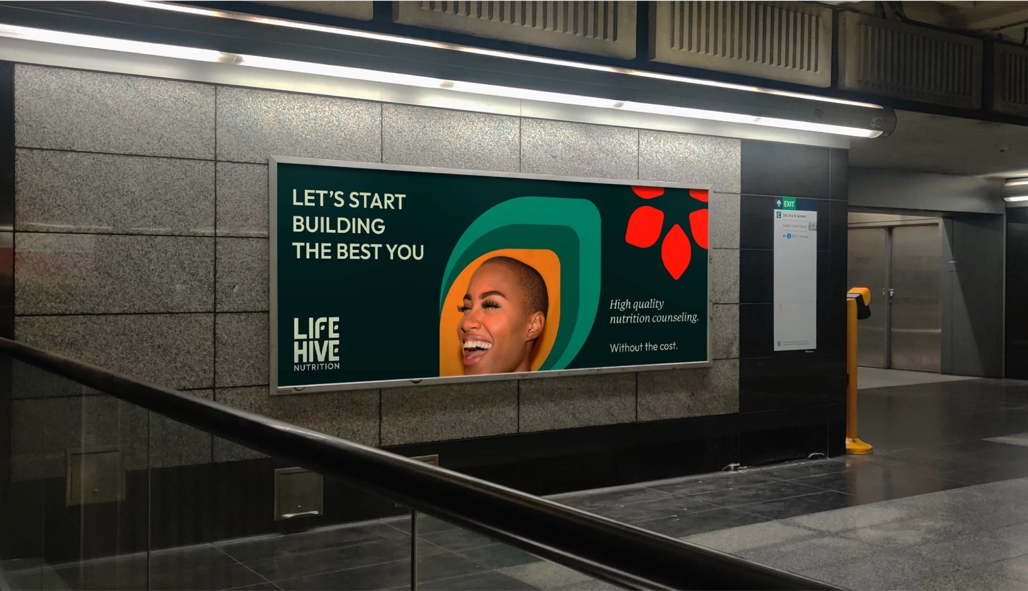
Studio Newfound’s identity, led by Billy DeNatale, carried the same leaf shapes and plain-spoken voice into out-of-home, social and merch. Because the website used the same parts, every touchpoint reads as one brand.
CAMPAIGN LINE
“Your biggest project is yourself.”
Out-of-home composition on a subway platform screen.




(11)
Where it landed
After six months of collaboration, iteration and refinement, the new site launched: welcoming, informative and consistent with the brand everywhere it appears.
Launched
December 2023, after six months
One front door
Three offers under one site
One system
From Billy DeNatale’s brand to the web
Visit lifehivenutrition.com
(12)
What I’d carry forward
Three things this project reinforced about designing for a service business.
01
Trust is decided on the first screen
People judge whether a practice feels safe before they read a word. A real face, warmth and one clear action did more than a list of features.
02
Guidelines are a starting point
A brand book doesn’t cover every web state. The job was extending Billy’s system — components, framing, spacing — without diluting it.
03
Design the system, then the page
Treating the leaf, the portrait and the pill button as reusable parts is what made the site and the campaign feel like one voice.
UP NEXT
CASE STUDY 003 · LIGHTCERT


Lightcert
A fan app that turns a crowd’s phones into one synchronized light show. No light sticks required.
ROLE
Product Design Intern
PLATFORM
iOS app
View case study